Arts & Rec: Cornelius Gets Landmark Public Art Along with a New Recreation Center

By Page Leggett
ASC staff doesn’t always get to witness the immediate reaction from the public after public art is installed. But they got an instant, and enthusiastic, response during the installation of a new work in Cornelius.
“I was outside with Vancouver artist Jill Anholt until about 1:30 in the morning that last night she was here,” recalled Todd Stewart, Arts & Science Council vice president for public art. “We were testing the lighting programs on her ‘Crop Rotations.’ People were driving up and down Old Statesville Road honking and cheering. It really looks amazing.”
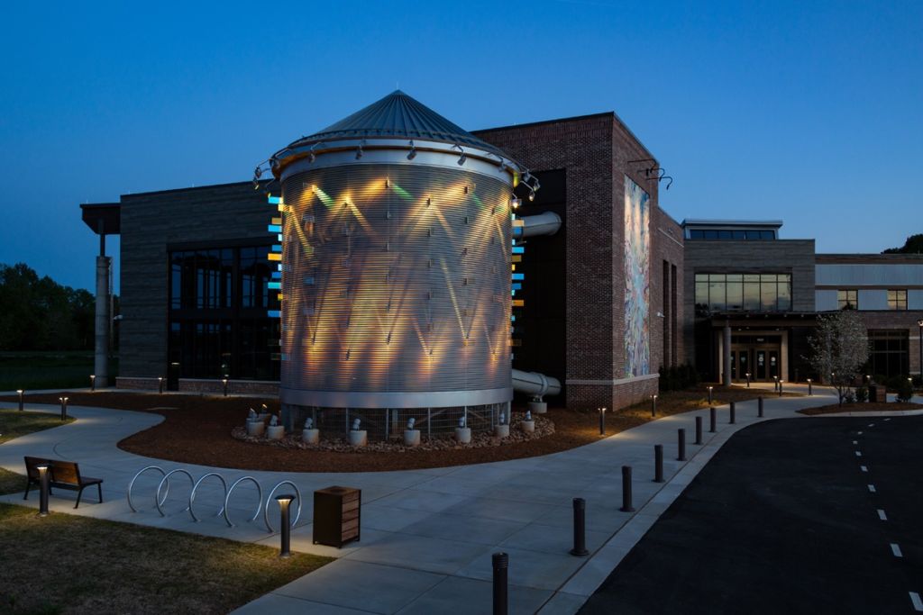
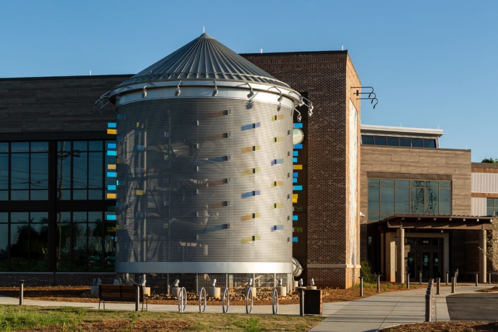
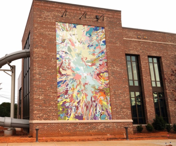
The source of all the early-morning hoopla? One of two public art projects for the new Northern Regional Recreation Center. The inspiring new center pairs separate public artworks – “Of The Trees and Sky” by local artist Maja Godlewska, an artist and UNC Charlotte art professor, and the traffic-stopping “Crop Rotations” by internationally known artist Jill Anholt of Jill Anholt Studio.
Anholt has won national and international acclaim for her public artworks.
“Jill’s work is fabulous,” Stewart said. “We’ve wanted to work with her for a while, and I consider myself lucky to have gotten the chance.”
“We worked closely with LS3P Architects, who designed the center,” Stewart continued. “They made our job easy because the building is beautiful, for one, but there are also some really interesting key features that lend themselves to public art.”
A silo, for one.
The silo is “a prominent architectural feature that came about because the waterslide for the aquatic center comes out of the building to save space on the interior,” Stewart continued. “And LS3P wanted to disguise that waterslide. So, they came up with a really exciting idea to contain it in a perforated metal silo to reference the area farmland and agrarian history of Cornelius. It’s a tie-in with the history, but it’s also a very dramatic architectural element.”
In her artist statement, Anholt wrote: “‘Crop Rotations’ seeks to create a strong visual identity for the new Northern Regional Recreation Center … that references the local environment… The work explores the intersection of regional agriculture and farming patterns with the active nature of the recreation center.”
“Composed of rows of … glass fins that shift in color activated by sunlight during that day and programmable LEDs at night, the artwork … creates an intriguing dance of light and color that oscillates between natural and constructed forms and phenomenon.”

Those glass fins can be seen as a tribute to the aquatic center inside. Seen another way, Stewart pointed out, they might look like rows of crops.
“To some, it may look like she ‘planted’ the glass elements on the side of the silo,” Stewart said. “She went less and less literal with it as her design developed.”
Stewart gives Anholt kudos for her artistic nod to the farming history of the land and her ability to align that with the very purpose of the structure.
“She heard loud and clear that we wanted to honor the agrarian history of this area,” he said. “Her intent was to create something that would highlight the similarities between naturally occurring cycles that farmers pay attention to and something dynamic to highlight the recreation that would be happening here and tie those together.”
The dynamism comes in the form of a light show.
“We were interested in using light for this, but I told Jill that most of the traffic to this place will occur during the day,” Stewart said. “So how do you do a light installation outside during the day? That was her design challenge, and she aced it. She found a material called dichroic glass. When the light hits it – whether it’s natural or artificial – it reflects it back in different colors. And it also refracts the light; it kind of splits the prism in terms of creating different hues. When you’re looking at it, it could look blue, orange, pinkish, green or yellow.”
For nighttime, Anholt installed different programmable LED light fixtures on the roofline and base of the silo, and they are very finely and precisely focused, Stewart said. She created three programs that cycle through from dusk till dawn.
Denis Bilodeau, a member of the Cornelius Town Council, was on the voting panel that helped choose the artists to create the work that helps distinguish the center.
“There were a significant number of entries,” he said. “I was impressed with all of them. When we met the artists, I could see their passion. Narrowing it down was difficult.
“ASC did a fabulous job of getting a lot of folks involved,” he concluded.
Anholt’s work, while the most visible, is just one half of the public art on view at the center.

‘Perfect spot for a mural’
In addition to the silo, Stewart noticed what he called another really interesting architectural feature.
“Along the wall going toward the main entrance to the building, LS3P carved out a space that seemed to me the perfect spot for a mural,” he said. “They were gracious enough and excited enough about the potential to allow us to use that as a mural opportunity for an artist. That’s where Maja came in.”
Like “Crop Rotations,” Godlewska’s work celebrates both the farming history of the area and the health/wellness purpose of the center.
“Maja works in abstraction, but there’s an element of realism to her work, as well,” said public art project manager Randella Foster. “The color is vibrant, and the mural itself is, in parts, whimsical.”
Godlewska took more than recent local history as her inspiration.
“I looked at ancient Roman garden wall paintings and Baroque frescoes for inspiration when working on the composition,” she said. “I included areas of higher intensity, cheerful and happy, counterbalanced with neutral sections to provide the rest for the eye.”
The center gave Godlewska a giant canvas on which to work. Her mural stretches 16’8” wide and 30’ high.
“While designing the mural, I was thinking about the feeling of a long, summer day spent in nature strolling, playing ball, daydreaming, being in a moment, carefree,” Godlewska wrote in her artist statement. “I intended for the painting to evoke positive … emotions associated with recreation, physical activity and enjoying a good time with friends.
“I aimed to create a sense of movement and wonder and chose colors that bring to mind an enchanted forest, a sunset or an early evening afterglow,” she continued. “Some of the hues are in harmony with the surrounding brick, while others, such as the cool teals and greens, create a contrast and bring to mind the distant sky or tree canopies.”
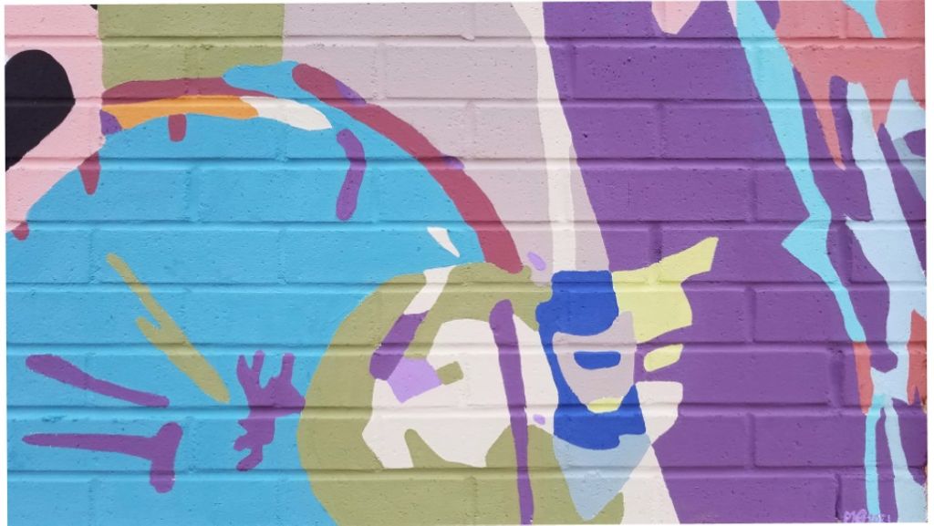
“I view it as a visual puzzle, inviting the viewer to decode abstracted forms, to take time and observe, to discover new details on each return.”

Foster said all the action in the mural reminds her of an “I Spy” or “Where’s Waldo?” book.
The two works of art were created separately but they’ll inevitably be viewed together. And the pair of them honor the purpose of the recreational facility while serving as colorful landmarks. And points of pride for the people of northern Mecklenburg County.

